Useful digital signage examples show what a screen says, where someone sees it and what they can do next. They include a product offer beside merchandise, a café feature at a queue entrance, an exhibition demonstration time, a showroom explanation, a venue direction and a staff notice.
The message and the location should determine the layout. A passing visitor needs a different answer from someone examining a product or studying a menu. Below are six planning examples with sample copy, placement choices and update responsibilities. They are content concepts you can adapt, rather than customer installation reports.
What makes digital signage examples useful in a real space?
Before choosing a template, ask what the viewer needs to know at that location. At an entrance, it may be “What is happening here?” Beside a sample, it may be “How does this part work?” At a corridor junction, it is “Which way should I go?”
For walk-by locations, give the viewer a clear subject, one main message and an immediate action. Keep important terms visible with the offer. Check the design while walking the actual approach; a slide that looks clear on a desktop may be difficult to understand across a bright aisle.
For waiting or close-inspection locations, secondary detail can be useful. A showroom visitor may examine a sequence beside a physical sample, while someone at a menu board needs to compare items and prices. They still need a clear hierarchy. Waiting nearby does not mean they will watch a complete playlist.
As you compare examples of digital signage, also separate prepared media from connected content. A graphic can be updated by a designated staff member. Automatic prices, room calendars and live dashboards need a compatible player or integrated playback system, software, data access and someone responsible for the connection. The display surface alone does not provide those functions.
Six digital signage content examples, with copy and placement
1. Retail: introduce a seasonal collection beside the merchandise
At a homeware display, a shopper wants to know what is featured and where to examine it. A useful design could contain:
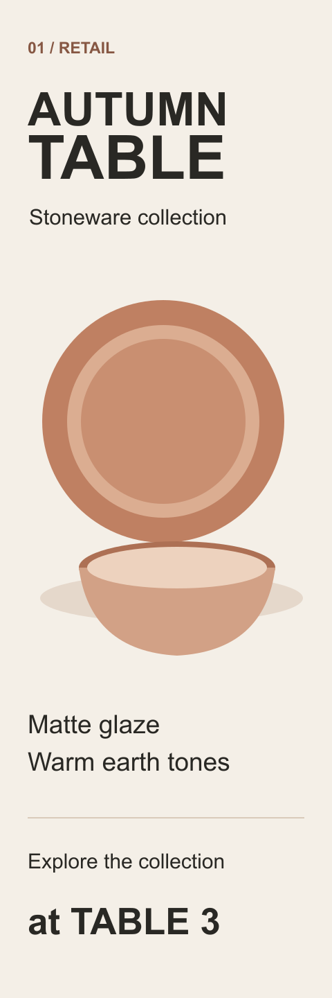
AUTUMN TABLE
Stoneware collection
Matte glaze · Warm earth tones
Explore the collection at Table 3
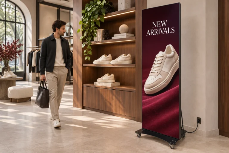
Use a strong product image with the collection name above it and the location below. If the campaign includes a price or discount, make the actual product, offer period and relevant terms clear; decorative typography should not obscure them.
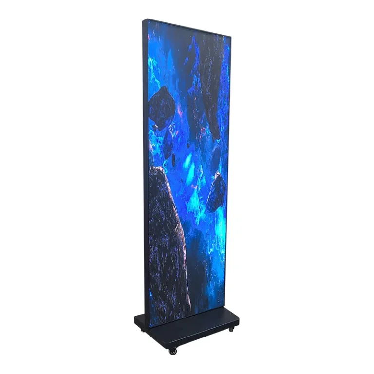
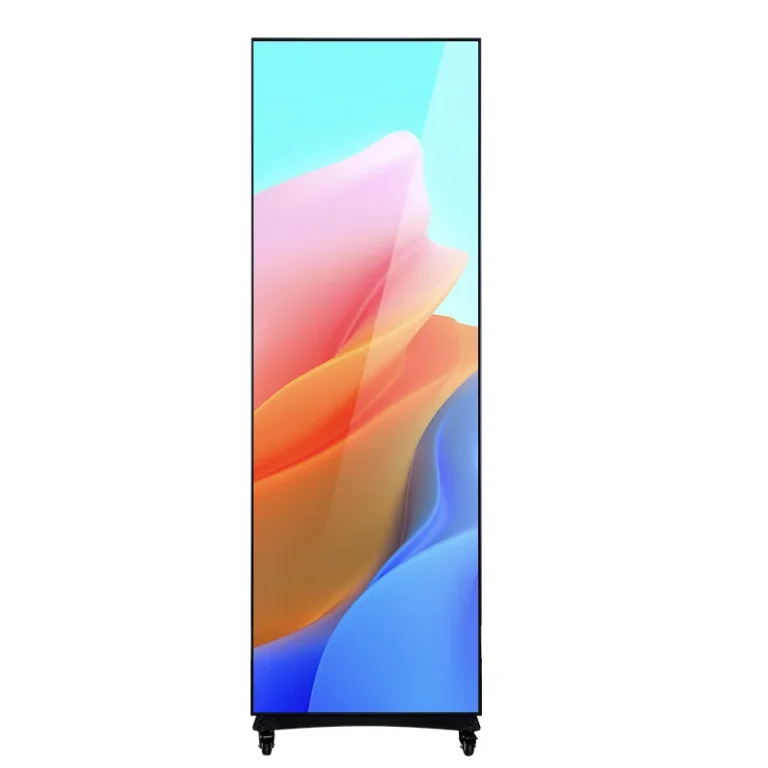
A narrow portrait layout can suit this single-subject message. Position the display on the approach to the merchandise, angled toward arriving shoppers. Check the base, support and power cable against the real circulation route rather than planning with the cabinet width alone.
The visual merchandiser or floor supervisor should update the content when the display moves, the range changes or an offer ends. A visually polished slide that directs customers to the wrong table is still a poor sign.
2. Café: promote one feature at the queue entrance
A guest approaching the queue may be deciding whether to stop. A focused feature can answer that question without becoming the entire menu:
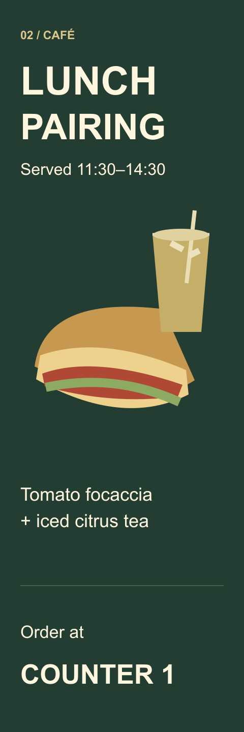
LUNCH PAIRING
Tomato focaccia + iced citrus tea
Served 11:30–14:30
Order at Counter 1
Give the food image and pairing name priority. Show the actual price and applicable terms when preparing a real promotion. The sample above demonstrates the information hierarchy rather than a complete price or dietary notice.
A portrait poster can work for one feature. A complete menu with many sizes, prices and dietary choices needs a different layout and viewing test. A wider screen, several clearly organized screens or a separate menu may be more appropriate; do not squeeze every item into a narrow panel simply because that panel is available.
The shift manager should remove unavailable items and expired time windows. If the selected playback system supports scheduling, it can help manage routine changes, but someone still needs to handle an early sell-out.
3. Exhibition: make the next demonstration easy to find
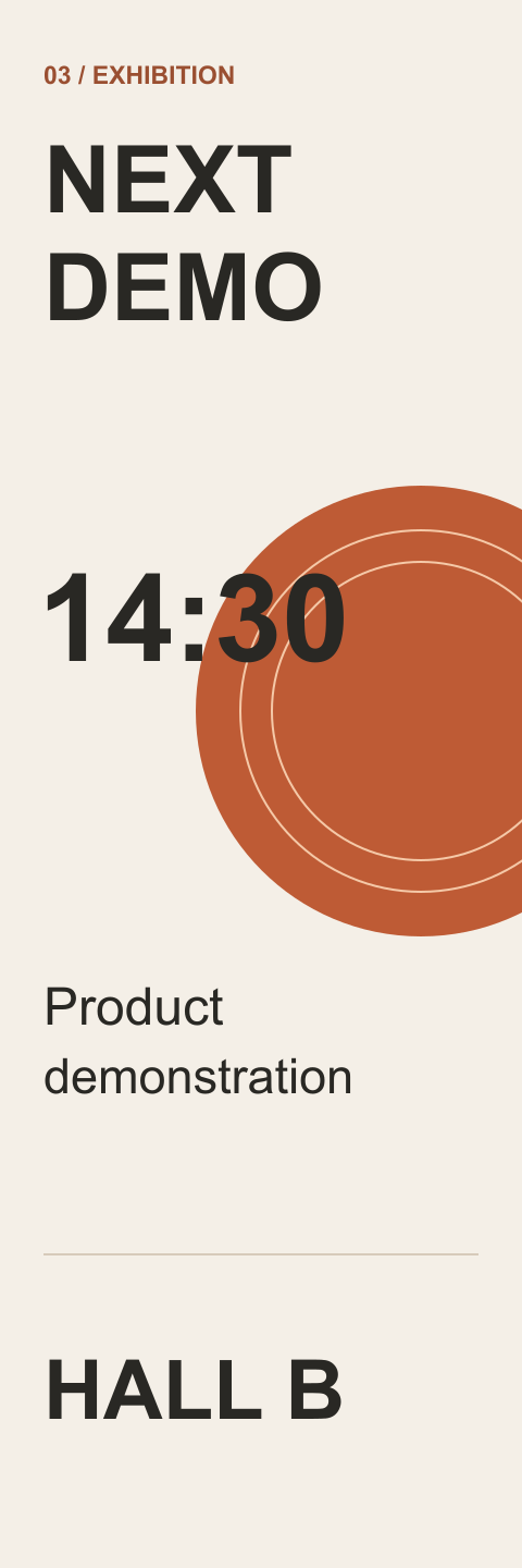
An exhibition visitor needs the time and location before deciding to enter a stand. Give those details visual priority:
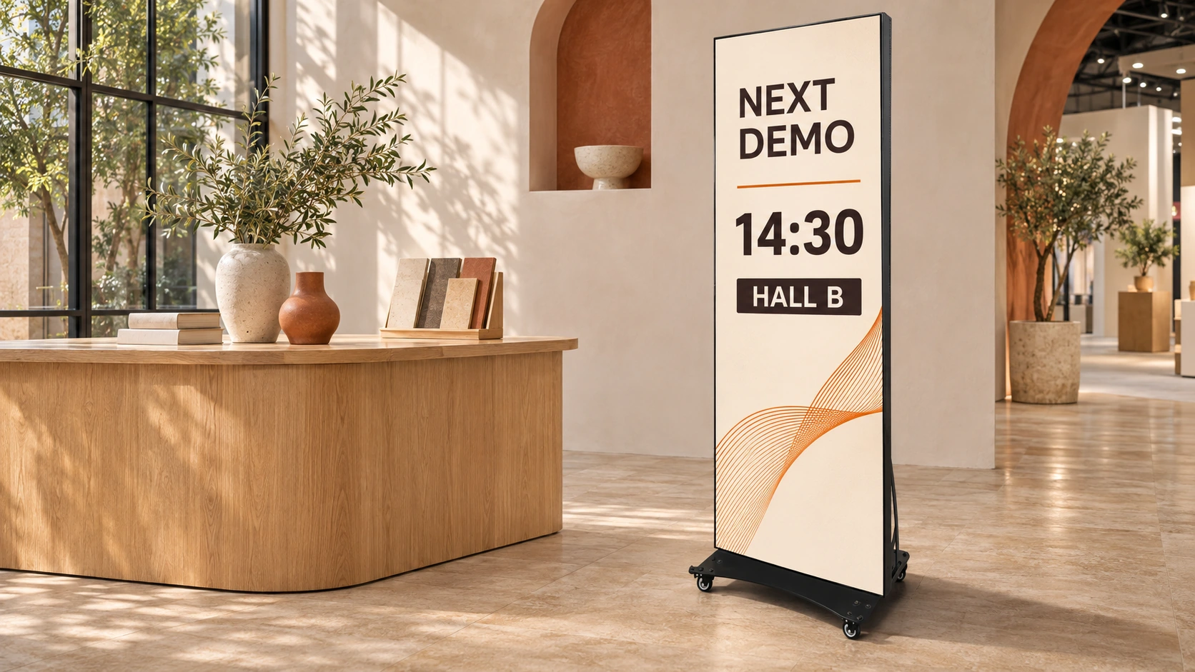
NEXT DEMO
14:30
Product demonstration
HALL B
Place the display where people can read it before choosing a route, within the booth’s permitted space. Keep the demonstration title specific enough for the intended audience. If duration or another session time helps the decision, include it only when the layout remains readable.
A booth coordinator can replace a prepared slide after a session or a schedule change. A live countdown or calendar connection is a separate system requirement. Ask how the selected player behaves if its connection fails instead of assuming a prepared graphic or a cloud service automatically guarantees uninterrupted playback.
With a mobile unit, recheck sightlines and cable routing after moving it. The best position is the one that serves the approach while preserving the required circulation space.
4. Showroom: explain one detail beside the physical sample
Beside a product sample, a visitor has time to ask a more specific question. For a demonstration of a locking clip, the screen might show:
HOW THE CLIP LOCKS
Insert · Slide · Check engagement
Close-up demonstration
Compare with the assembly on Rack B
Use the actual product’s approved demonstration sequence. Keep the working part large enough to inspect, and use short labels that correspond to visible actions. Any load, clearance or installation specification must come from that product’s current documentation rather than an attractive sample layout.
A wider portrait canvas may help when a close-up image and explanatory text need to share the frame. WUYESTAGE’s separate modular foldable LED poster display has a 1280 × 1920 mm cabinet format. Compare the active canvas, viewing position and rear-service space before choosing it for this task; the wider shape does not itself guarantee legible small labels.
A silent visual sequence can communicate without relying on visitors hearing audio. Confirm the actual playback requirements and have the showroom product manager replace the media when the demonstrated component or procedure changes.
5. Venue: show the direction at the point of choice
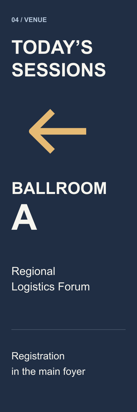
At a hotel or conference foyer, a useful sign answers “Which way do I turn?” before the visitor passes the junction:
TODAY’S SESSIONS
← Ballroom A
Regional Logistics Forum
Registration in the main foyer
Give the destination and direction priority over decorative event artwork. A longer list of rooms may require more width, a different information structure or more than one information point.
The events coordinator should check the arrows from the visitor’s actual approach. Moving a mobile display or turning it toward another entrance can make the same graphic misleading. Update room changes and remove completed events. Treat this as event information alongside the building’s required permanent signage.
6. Workplace: separate a staff notice from a live dashboard
At a staff entrance, a short announcement can be more useful than a miniature version of an operations dashboard:
TEAM BRIEFING
Today · 15:00
Training Room 2
Questions? Ask your shift lead
The shift lead owns the time, room and removal of the notice. If different shifts see different messages, specify who selects the correct content and how the change is made.
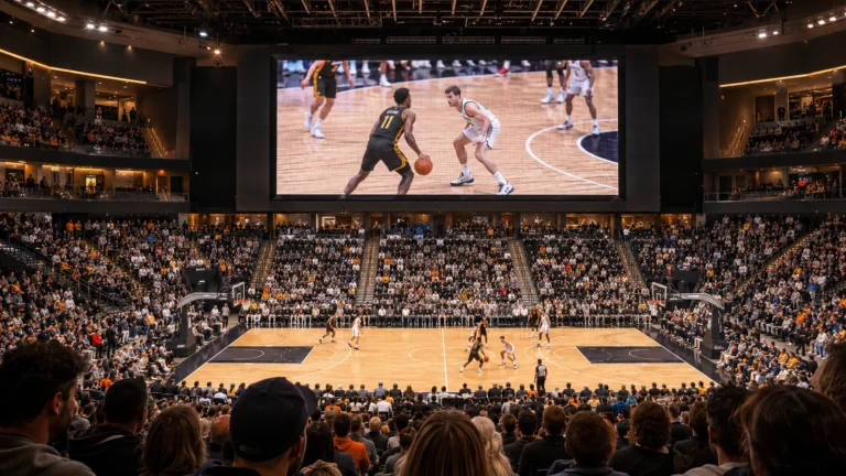
A live dashboard is another task. Chart axes, timestamps and status fields need a layout that people can inspect at the intended distance. A wide display may suit that layout better than a narrow poster. Automatic data also needs an appropriate software and playback arrangement, authorized access and an operations or IT owner. A stale dashboard can look current unless the display makes its update time clear.
Match the example to the screen and update workflow
These digital signage content ideas should lead to different production decisions:
| Message | Design priority | Update trigger |
|---|---|---|
| Retail collection | Product image, collection name, merchandise location | Range, placement or offer changes |
| Café feature | Featured item, available period, ordering point | Service period, price or availability changes |
| Exhibition demonstration | Next time, relevant subject, location | Session finishes or schedule changes |
| Showroom explanation | Visible detail and labels beside the real sample | Product or procedure revision |
| Venue direction | Correct destination and arrow | Room, event or display position changes |
| Staff notice | One current announcement and contact | Time, room or intended audience changes |
Start with the simplest content workflow that can keep the message accurate. A prepared slide may be enough for a stable announcement. Frequent updates across many locations may justify a connected system, with its own compatibility and administration requirements.
For a movable indoor information point, compare LED poster display formats against the actual artwork and site. A menu wall, a touchscreen directory and an entrance poster solve different problems; they should not inherit the same hardware recommendation.
Why a 16:9 or 9:16 template may need to be rebuilt
Not every portrait screen uses the 9:16 proportions of a rotated television or social-media story. WUYESTAGE’s standard indoor LED poster display lists two cabinet formats:
- 640 × 1920 mm: a 1:3 width-to-height ratio.
- 960 × 1920 mm: a 1:2 width-to-height ratio.
The separate 1280 × 1920 mm modular foldable cabinet has a 2:3 ratio. These are cabinet dimensions, not the full floor footprint. Confirm the active display area and final controller pixel map for the ordered unit before exporting artwork.
A worked pixel-planning example
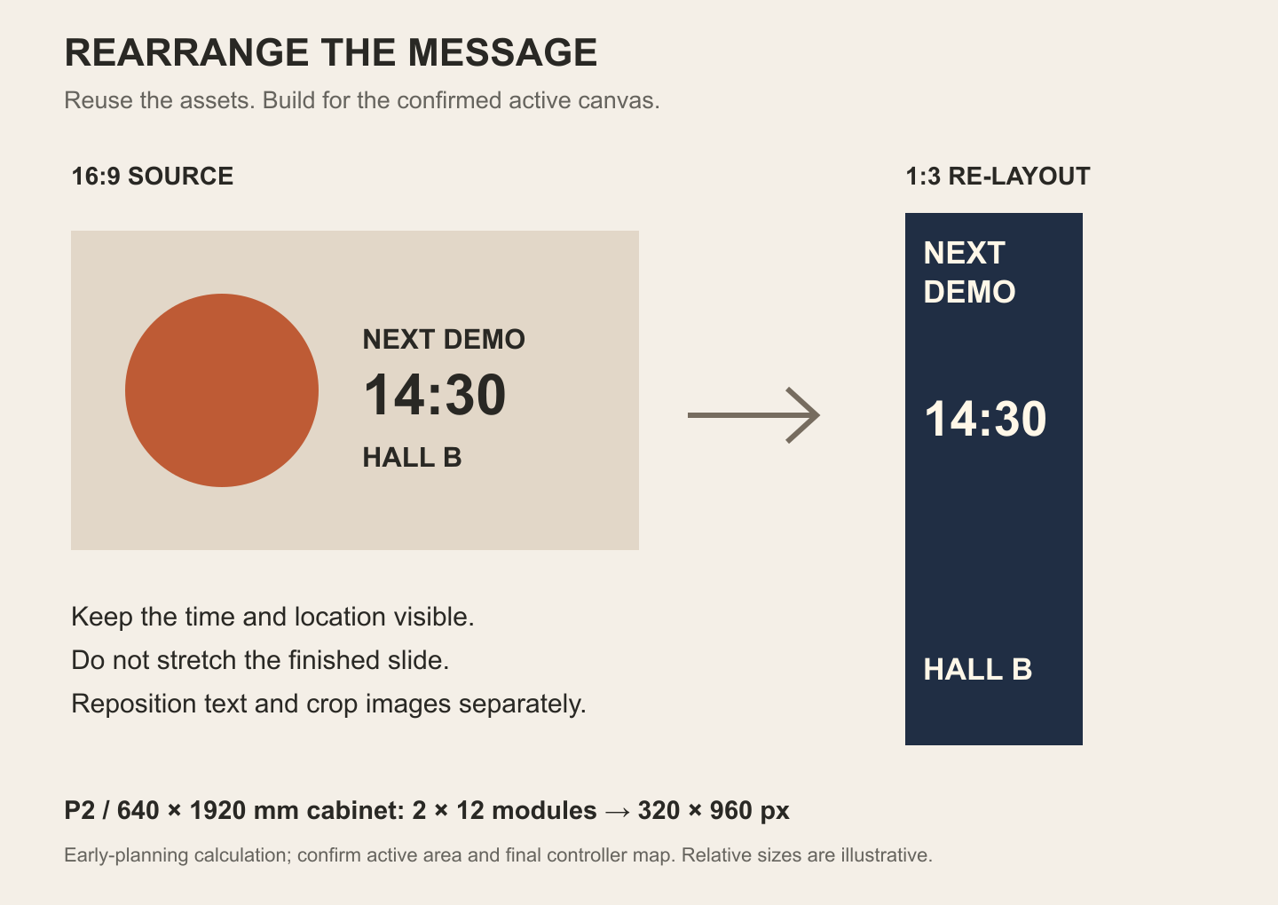
For the standard P2, 640 × 1920 mm configuration, the supplied 320 × 160 mm module contains 160 × 80 pixels. Arranging two modules across and twelve high gives:
Width: 2 × 160 = 320 pixels
Height: 12 × 80 = 960 pixels
That produces an early-planning canvas of 320 × 960 pixels, or 1:3. It is a calculation from the supplied module data, not a display test. Another pitch or cabinet width changes the pixel count; confirm the final map for the selected system.
Reuse the assets, then rearrange the message
Simply fitting a horizontal slide inside a narrow portrait canvas can leave large unused areas and make the text small. Stretching it distorts the content. Cropping the complete slide may cut off prices, labels or directions.
Instead, reuse the original photography, colors and copy as separate elements. For the demonstration example, place “Next demo” at the top, give the time the strongest emphasis, and put the location beneath it. For a product feature, choose a suitable image crop and place the action where it remains visible.
Do not treat this as a universal three-zone template. The purpose is to rebuild the hierarchy for the actual message. Test the final artwork on the intended display at its native map, expected brightness and viewing position. Small text, fine lines and image details need particular attention when choosing pixel pitch.
What to send when moving from an example to a screen order
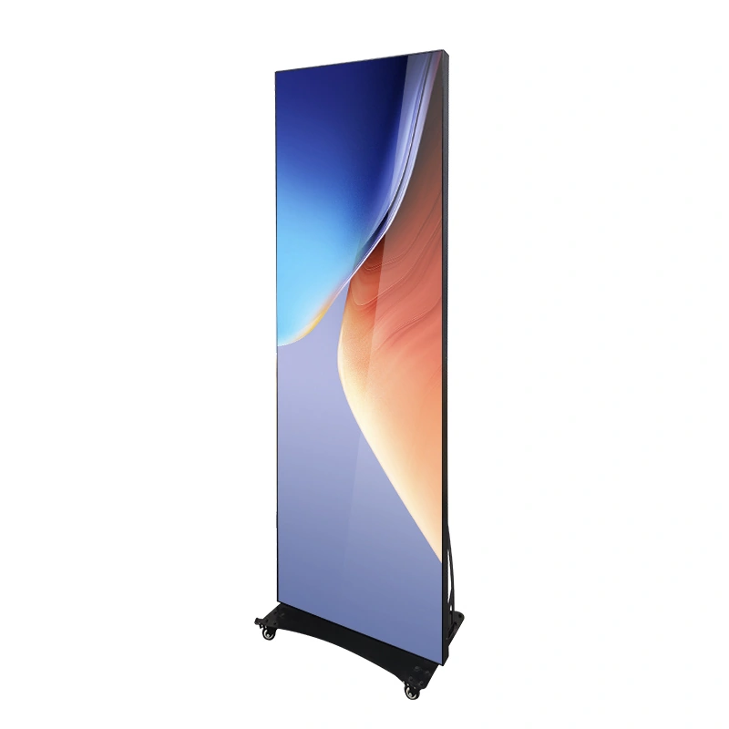
Prepare a sample slide or short media sequence together with a location photo or plan. Mark the viewer’s approach, expected viewing distance, available placement space and ambient-light conditions. Include the complete unit’s base, support, service access and cable route in the site check.
WUYESTAGE’s standard and modular foldable poster configurations discussed here are IP31 indoor products. Test the actual artwork under the intended conditions, especially beside bright windows; a brightness specification alone cannot establish readability at that location.
Describe the update method you need: staff-replaced files, scheduling, a live feed or coordinated playback. Confirm the selected controller, player, supported media and any software or network requirements together. Then add quantity, destination and the required delivery or event date so the supplier can compare a suitable configuration.
If you are deciding whether the campaign is worth the investment, use the separate guide to digital signage effectiveness for evidence and measurement. A clear content example helps define what to test; it does not establish a sales result.
Frequently asked questions
Can I reuse existing 16:9 or 9:16 artwork?
Yes—reuse the photography, colors and copy, then re-layout them for the confirmed active canvas. Keep important information inside the new composition instead of stretching or blindly cropping the complete slide. Review the export on the actual screen at the intended viewing distance.
Do live menus, calendars and dashboards need extra software?
Automatic external updates need compatible playback and software, access to the relevant data and an assigned owner. The player may be separate or integrated into the selected system. Confirm that arrangement for the order rather than assuming every display includes a CMS, network connection or data integration.
How often should the content change?
Change it when the information or audience changes: an offer ends, an item sells out, a room moves or a session finishes. Assign an owner and a removal or review time to each message. Choose slide timing by testing the actual content and viewer situation rather than applying one duration to every screen.