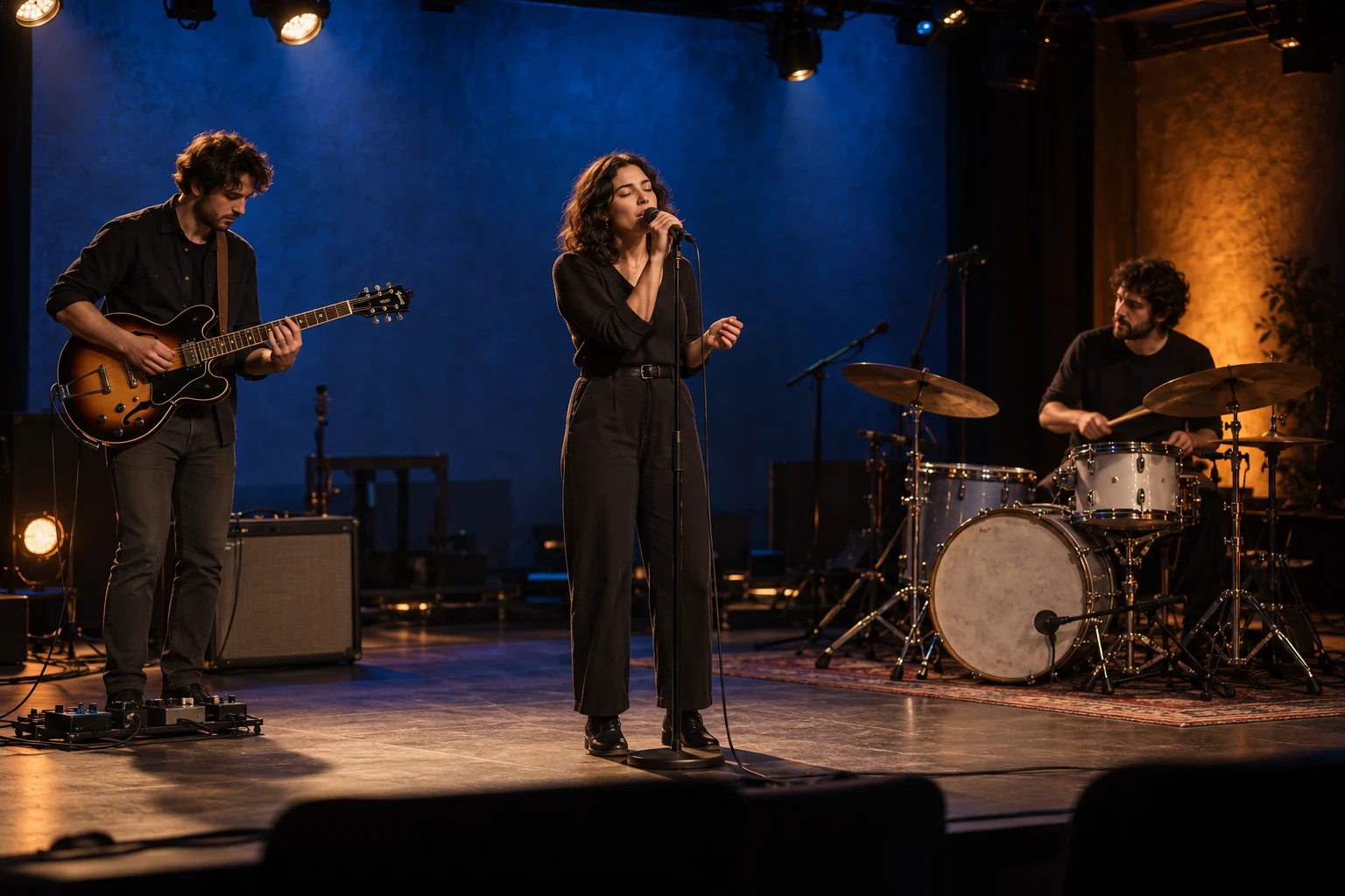
Choose stage lighting colors by deciding what the audience needs to see first. Give performers, scenery and visible effects separate jobs, then select colors that work together from their actual positions. A blue background with a warm face light is a different design from blue and amber beams overlapping on the same face.
For rental companies and venue buyers, a useful palette must also survive a change of fixtures, costumes or camera settings. Describe the required look clearly enough to test a sample and reproduce the cue.
Must front light always be white?
No. White or lightly tinted front light is a useful starting point when facial expression, clothing detail or a presenter’s appearance matters. Saturated front light, silhouettes and deliberate color shifts can also serve a production. The choice depends on the cue and what must remain visible.
Check the performer in the proposed look rather than judging an empty stage. Include the costumes, makeup and camera view when those affect the decision. A tint that works for one performer or fabric may need adjustment for another.
Keep these lighting jobs separately controllable where the design requires them:
- People: expression, body shape and important costume detail.
- Background: scenery, depth and the scene’s color environment.
- Accents: a musical hit, a scenic detail or the visible face of an effects fixture.
Separate control lets you reduce a background color spilling onto a presenter without losing the whole palette. It also lets you remove front light intentionally for a silhouette and restore it for the next speaking cue.
Stage light color combinations to try
Useful stage light color combinations start with a job for each color. The examples below are starting looks to rehearse, not fixed recipes or promises about how an audience will feel.
| Starting palette | Where to put the colors | What to check |
|---|---|---|
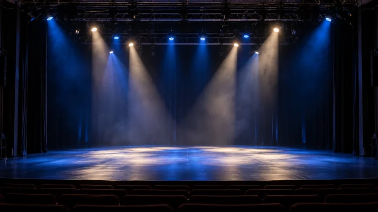
| Warm or neutral face light with blue behind | Keep readable light on the subject; use blue on scenery or as backlight | Does the performer remain distinct when the background reaches show brightness? |
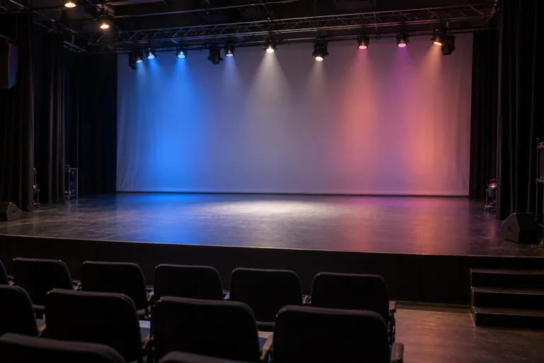
| Neutral face light with violet and cyan scenery | Put the stronger colors on separate scenic areas or select one as the dominant background | Do overlapping fields create an unwanted third look? |
| A pale warm/cool front-light pair | Aim the two looks from their planned positions and balance them on the performer | Can you see expression and shape without an unwanted cast on skin or clothing? |
| One background hue with a contrasting accent | Keep the background consistent; introduce the accent on a scenic feature or effect cue | Does the accent direct attention to the intended place? |
Do not decide from color names alone. “Amber,” “blue” and “lavender” cover many possible shades, brightness levels and source spectra. Record the actual fixture, selected mix and operating level once the look is approved.
For theatre lighting colors, include the scene, costumes and performer positions in the decision. A warm/cool pair may help shape a face, while a single tint or an intentionally unnatural color may better serve another scene. The theatre lighting design guide covers the positions and system planning behind those choices.
Put colors in different places before mixing them
Stage lighting color theory helps explain why an attractive pair of swatches can disappoint on stage: placing two colors beside each other and combining their light on one surface are different operations.
With additive mixing, colored light from separate emitters or fixtures combines on the illuminated area. Red and green light can combine to produce yellow. Suitable red, green and blue mixtures can produce white. With subtractive mixing, filters remove parts of a source’s spectrum. ETC’s explanation of stage color describes both processes and how illuminated materials change the result.
An additive complementary pair, such as red and cyan, can move toward white when its contributions are balanced. The exact result depends on the sources and their levels. That is different from a red area beside a cyan area, where the audience can still see two distinct colors.
When testing stage lighting color combinations, bring up each lighting area separately before viewing the combined cue. Watch where the fields overlap and where scenic color spills onto people. Adjust aiming, coverage, intensity or the selected mix according to the result.
A fixture’s color picker is a control tool. The illuminated performer and set are the result you are choosing.
Use mood as a cue brief, not a rule
Color can support a story, but it does not prescribe one response. Red may serve a celebration, a romantic scene or a warning. Blue may suggest night, distance or a calm background. Music, movement, surrounding colors, timing and the production’s cultural context change the reading.
Replace a vague instruction such as “make it energetic” with a visible task:
Keep the speaker clearly readable. Use a cool background during the presentation, then introduce a warmer accent for the reveal. Check both looks with the actual scenic surface and camera.
This gives the team something to build and approve. It does not depend on a claim that a particular hue always produces a particular emotion.
Turn the palette into a fixture and sample brief
Choose the color task before choosing the fixture. A broad scenic wash, a controlled performer light and an audience-visible lens effect may require different equipment or configurations.
The LED wash light range is a useful next step when the palette needs broad coverage or moving wash positions. Compare the required color across the usable field at the intended distance, including areas where adjacent fixtures overlap.
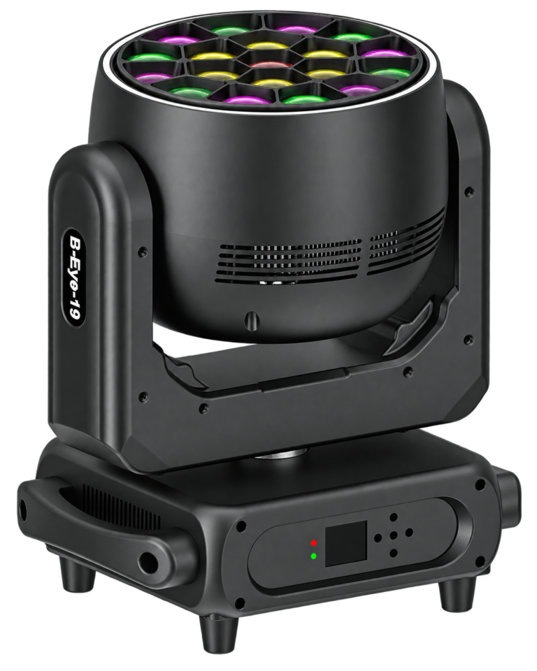
Also distinguish the light falling on the stage from the fixture’s own visible accents. For example, the RG-1940B rotating bee-eye moving head has a main light source, a rotating front disc and a separate RGB strip. Describe the stage look and the visible strip look separately, then confirm how the chosen control mode provides the required functions.
An RGBW label or a matching console color does not guarantee that different fixtures will reproduce the same appearance. For source selection, use the RGB vs RGBW comparison. For the palette itself, compare samples on the same target under comparable conditions.
Copy this cue color brief
Complete one record for each look that matters to the project. Keep the approved version with the fixture schedule and show file.
| Field | Your project entry |
|---|---|
| Cue and purpose | Cue name: ___; what the audience must see: ___ |
| People | Required face/body look: ___; intentional silhouette or saturated color: ___ |
| Background | Surface/material: ___; dominant color and intended coverage: ___ |
| Accent or visible fixture effect | Target or visible lens/strip look: ___; timing: ___ |
| Wardrobe and scenery | Fabrics, makeup or scenic samples used for approval: ___ |
| Viewing conditions | Audience position: ___; camera required: ___; camera settings/white balance: ___ |
| Fixture and control | Exact fixture/configuration: ___; mode/profile: ___; approved mix or preset: ___ |
| Operating cue | Working distance/aim: ___; levels: ___; fade or transition: ___ |
| Approval and repeatability | Reviewed by/date: ___; reference record: ___; differences requiring correction: ___ |
Check the cue in a practical sequence:
- View the people and relevant materials under the selected reference light.
- Add the background and accent areas one at a time.
- Review the complete look from the audience position and through the intended camera.
- Run the actual fade or transition, including the lower levels used in the show.
- Compare the relevant fixtures together and save the approved settings.
Keep the camera settings consistent while comparing samples. If you change exposure or white balance between views, record the change before judging whether the fixtures match. Photographs can document a setup, but their processing and display conditions make them an incomplete color specification on their own.
Questions before approving the palette
Can the same RGB values match colors across different fixtures?
They are a starting point, not a match guarantee. Emitters, optics, calibration and operating modes can differ. Compare the actual fixtures together on the relevant subjects and save the settings that produce the approved look.
Should the background and front light use the same color?
They can, when a unified wash is intentional. If the person disappears into the background, change the intensity, direction, color relationship or background level until the required separation is visible.
Do I need to buy more lights to improve the palette?
Not necessarily. First try the available positions, aiming, levels and separately controlled areas. Add equipment when the existing rig cannot produce a required coverage, color or independent cue.
Send the look you need to reproduce
For a WUYESTAGE fixture recommendation, send the cue brief with your working distances, mounting positions, camera needs, quantity and delivery country. Identify which colors fall on people or scenery and which belong to visible fixture effects. This helps us compare suitable configurations and define what the sample should demonstrate before a bulk order.